AROYA · Addium Inc. (formerly Meter Group) · Enterprise AGRICULTURE SAAS
Facility Dashboard
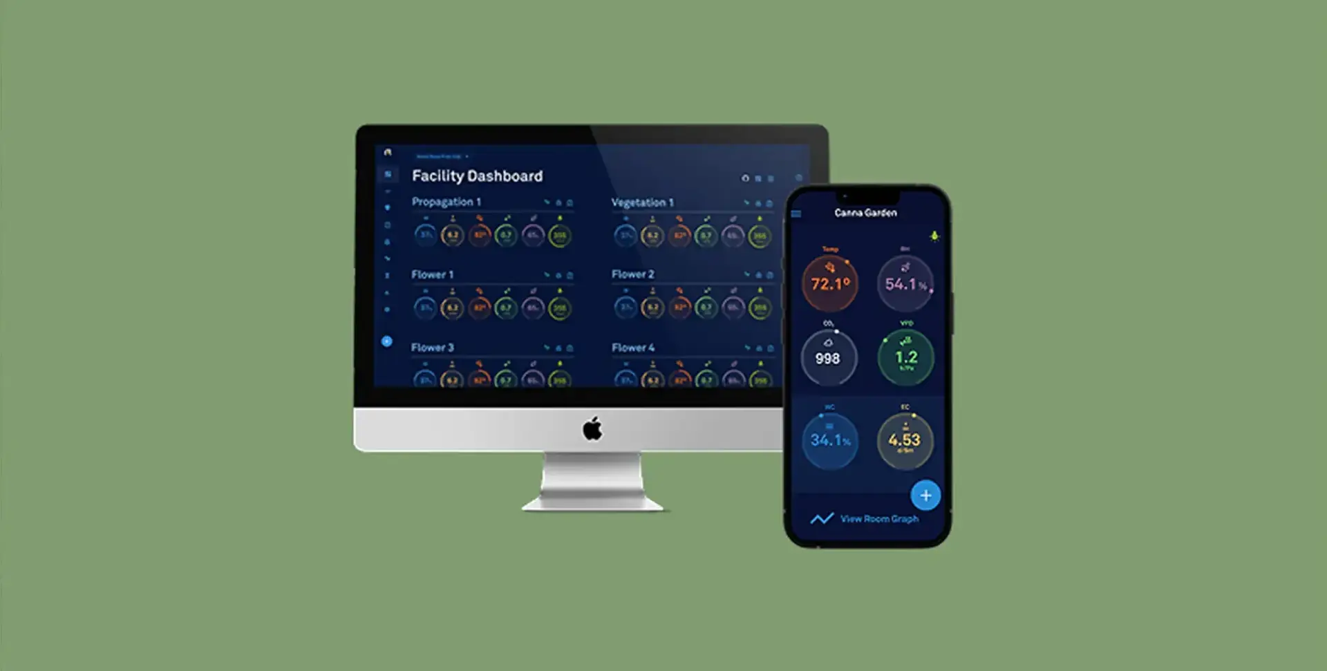
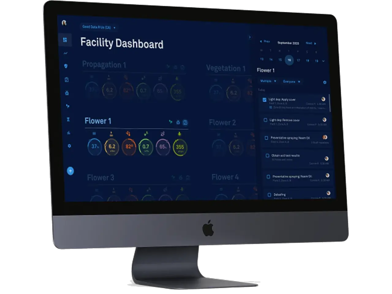
Facility managers were checking rooms one at a time. I led the design of a single real-time view across every cultivation room.
Role
Lead UX/UI Designer
+ mentoring a junior designer on the project.
What I owned
Research synthesis, user flows, wireframes, mockups, prototyping, usability testing, design QA, and ongoing design-system maintenance.
Team
Core team of 8: Development, Product, Executive, also partnered with Marketing and Client Success.
Tech stack
Figma · design
Zeplin · development handoff
Pendo · usage analytics
{{ s0 }}
Traffic increase
{{ s1 }}
Visitors
{{ s2 }}
Unique accounts
{{ s3 }}
Average time on dashboard
Pendo · Jan 30 – Apr 10 · Traffic increase from the project narrative
“The new facility card dashboard is a complete game changer.”
01 · Discover
A facility is more than a collection of rooms.
Facility managers relied on spreadsheets, manual records and individual room views to understand conditions. There was no central, real-time picture of the facility.
The goal was one overview for commercial cultivation, with room conditions and related information available together.
{{ stageCap }}
Research
Listening changed the design.
Through interviews, heuristic evaluation, and journey mapping, I examined how cultivation teams monitored their facilities and navigated room-level data. These findings shaped the direction of a centralized facility dashboard.
02 · Define the user experience (UX)
Bringing the facility into focus.
Paper sketches, digital wireframes and a lo-fi prototype shaped the structure and flows before any visual design.
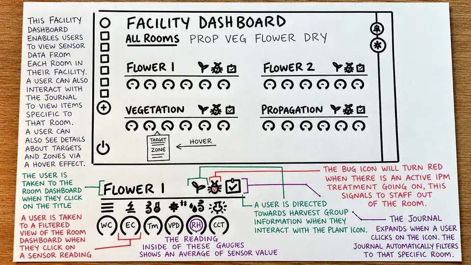
What it shows
Early sketches explored how room conditions, sensor readings, and operational indicators could be organized into a single facility dashboard.
Why it mattered
Sketching allowed multiple layouts and information hierarchies to be evaluated quickly, before investing time in digital design or detailed interactions.
Result
Initial concepts established a room-based dashboard structure, prioritizing environmental conditions, operational status, and quick access to information across the facility.
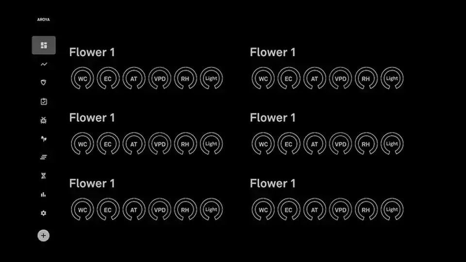
What it shows
Digital wireframes translated early sketches into structured layouts, defining room cards, environmental data displays, navigation, and supporting dashboard interactions.
Why it mattered
Establishing a consistent layout helped clarify information hierarchy, balance data density, and identify opportunities to simplify navigation between rooms.
Result
Room cards became the foundation of the dashboard, bringing essential environmental readings and operational information into a repeatable, scannable format.
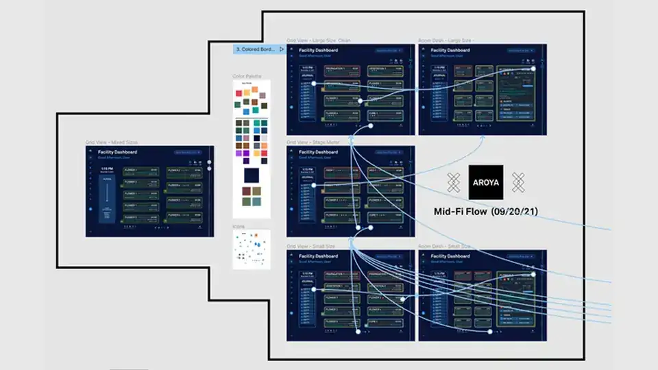
What it shows
An interactive prototype connected dashboard screens, demonstrating how users could navigate between rooms, review conditions, and access more detailed information.
Why it mattered
Connecting screens made it possible to evaluate navigation, interaction patterns, and workflow continuity before introducing high-fidelity visual design.
Result
Prototype exploration refined navigation and interaction patterns, establishing a clearer path from facility-wide monitoring to individual room details.
03 · Design THE user interface (ui)
The facility, in one view.
High-fidelity designs brought room conditions, sensor readings, and daily operations into a unified dashboard. Refinements to the design system, accessibility, and interactions helped make critical information easier to interpret and act on.

04 · Prototype
Giving the dashboard a pulse.
The high-fidelity prototype brought room monitoring workflows to life, allowing users and stakeholders to evaluate interactions before development.
What we tested
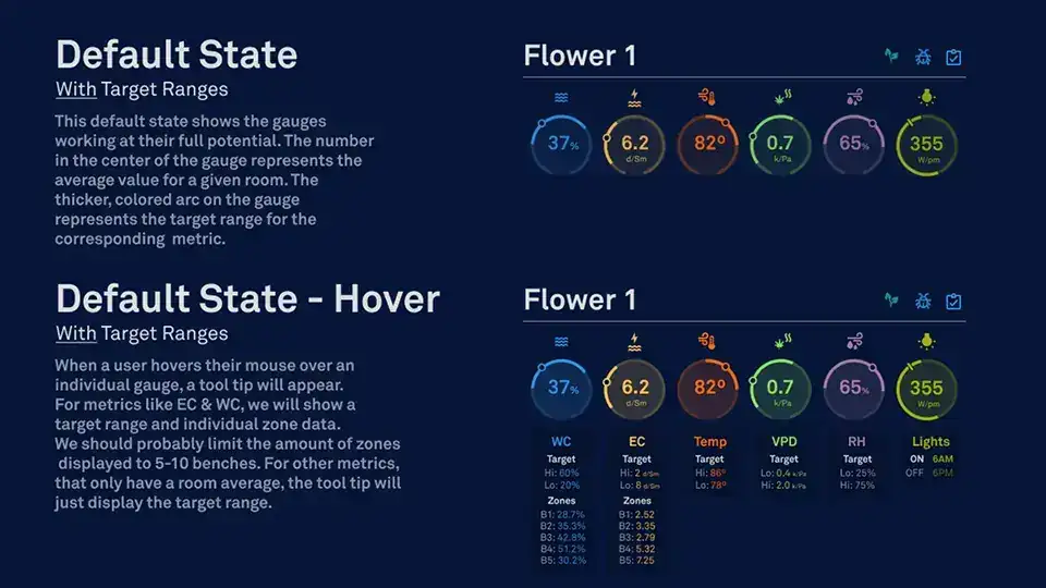
The interactive prototype demonstrated room navigation, environmental gauges, target ranges, and journal interactions. Testing helped evaluate workflow clarity and identify opportunities to improve usability.
05 · Deliver the designs
Carry the intent into implementation.
I partnered closely with engineering through delivery, so interaction details made it into the product.
What it shows
Detailed annotations captured interaction behaviors, component states, and design specifications for development.
Why it mattered
Clear documentation reduced ambiguity and helped engineers translate design decisions into functional interactions.
Result
Established a shared reference for implementation, clarifying expected behavior throughout development.
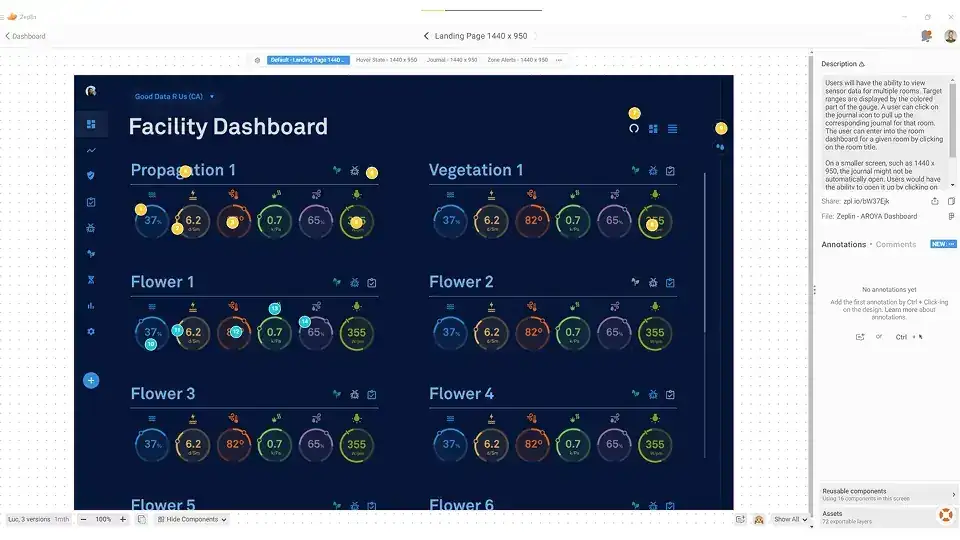
What it shows
Zeplin organized approved screens, design specifications, and supporting assets for engineering handoff.
Why it mattered
Centralized design resources gave engineers a consistent reference for translating prototypes into production interfaces.
Result
Streamlined design-to-development collaboration and supported consistent implementation across dashboard components.
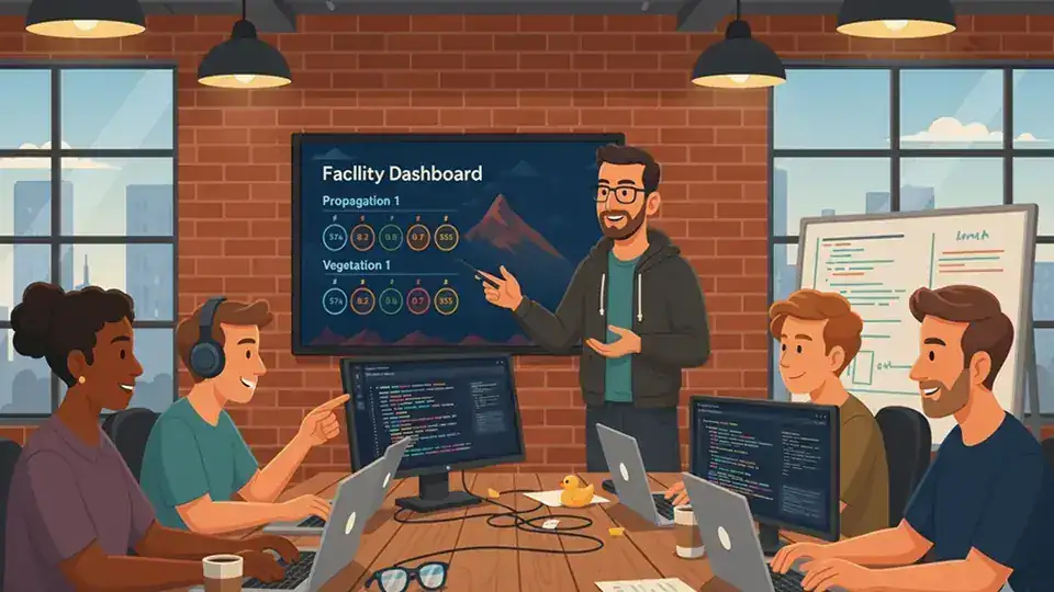
What it shows
Design QA reviews compared implemented interfaces against approved designs, interactions, and visual specifications.
Why it mattered
Collaborative reviews with engineering identified inconsistencies and helped preserve the intended user experience.
Result
Identified implementation gaps and supported refinements before release.
06 · Measure the IMPACT (Analytics + KPIs)
Usage, measured in Pendo.
Analytics and customer feedback showed how the dashboard landed.
What it shows
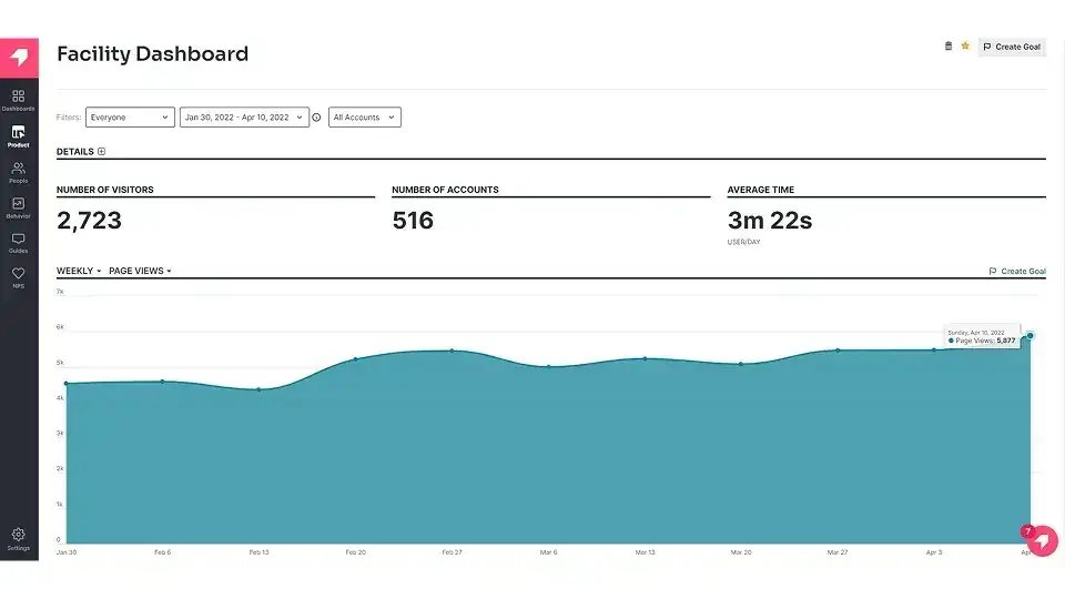
Pendo tracked 2,723 visits across 516 unique accounts during the initial measurement period, with an average dashboard visit lasting 3 minutes and 22 seconds.
Why it mattered
Early adoption provided insight into how cultivation teams engaged with the new dashboard and supported evaluating its effectiveness.
Result
The dashboard contributed to a reported 30% increase in platform traffic, demonstrating early adoption and establishing a baseline for future improvements.
What we heard
“The new facility card dashboard is a complete game changer.” Director of Cultivation, Sozo Cannabis Brands
Why it mattered
Direct customer feedback reinforced the value of consolidating room conditions and operational information into a single dashboard.
Result
Positive feedback validated the dashboard's direction and highlighted the importance of making cultivation data easier to access and interpret.

Research reveals hidden needs
Direct conversations with growers uncovered operational requirements, including the need for clearly visible IPM treatment status.
Consistency supports scalability
Reusable components and established design patterns helped maintain consistency as the dashboard evolved.
Result
Combining user research, scalable design practices, and usage analytics established a foundation for evaluating and improving future product experiences.

Project summary
Real-time insights at a glance.
Over about three months, I led AROYA's facility dashboard from research and wireframes through high-fidelity design, prototyping and delivery. Room cards brought every room's sensor readings into one overview.
Visit AROYA{{ mEyebrow }}
{{ mTitle }}
{{ mBody }}
{{ x.label }}
{{ x.text }}